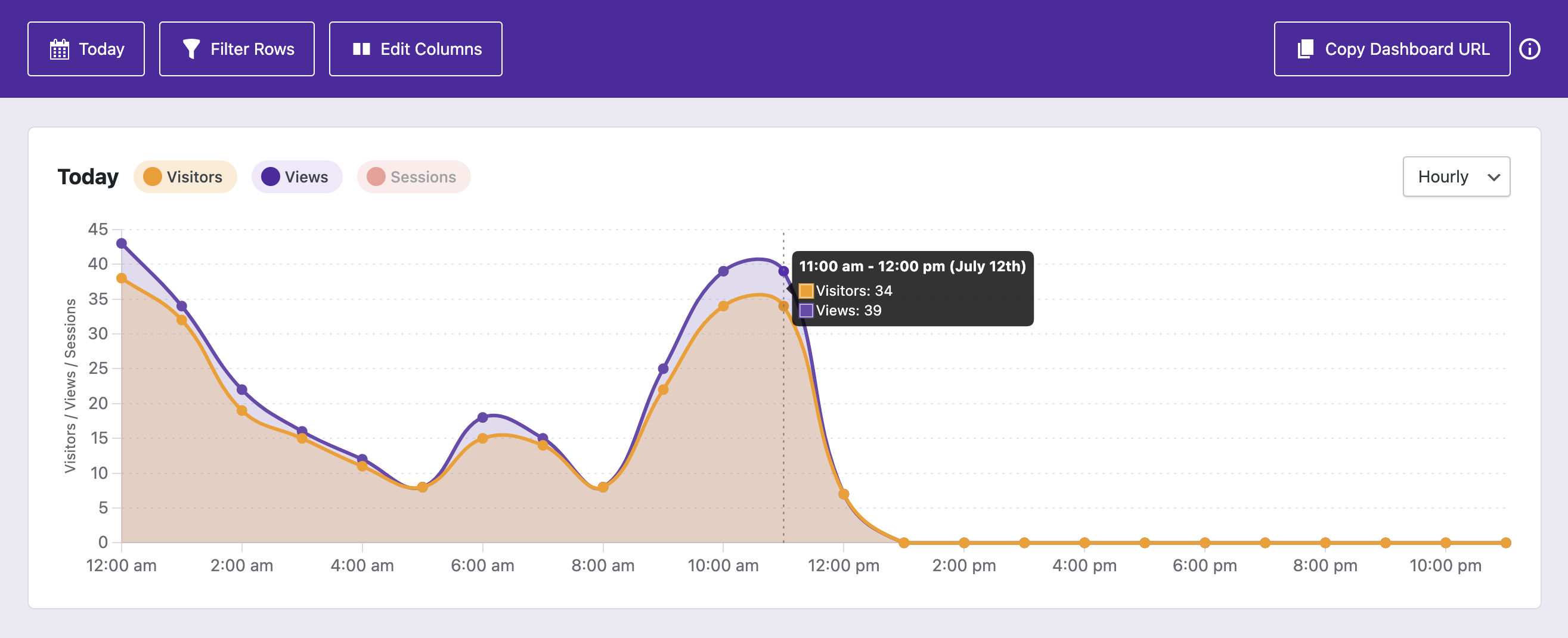
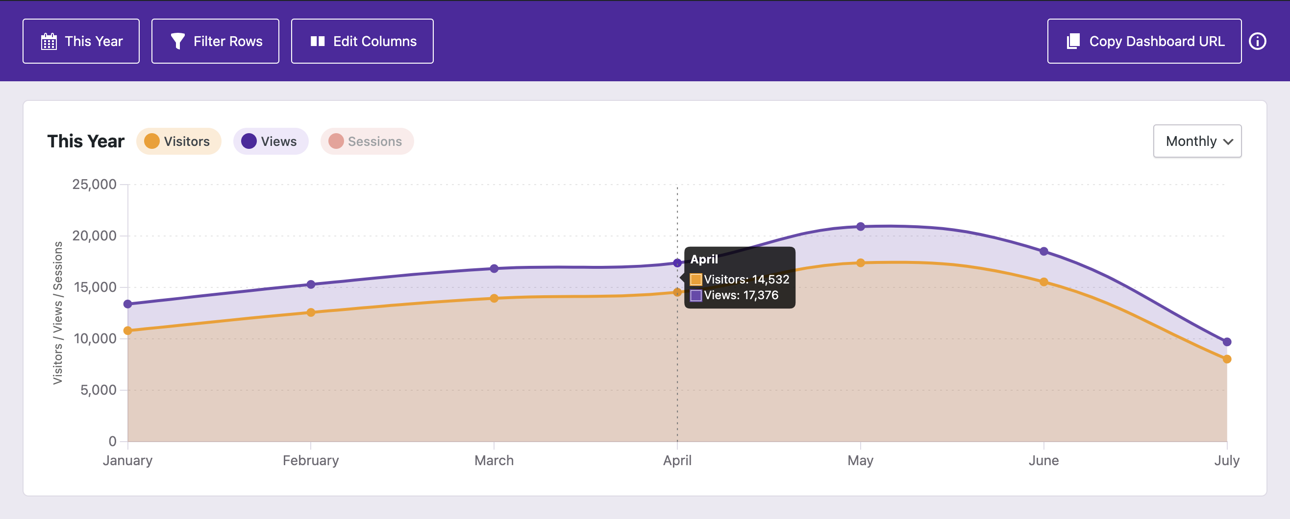
While the chart will choose the most appropriate interval for the date range you select, you can manually switch between them as well using the new interval select:
This update was mainly about adding the new chart intervals, but we also made a change to truncation.
In order to better fit large numbers, we applied truncation to the quick stats in the previous update. However, we overdid it and truncated smaller numbers that didn't really need it.
Moving forward, only numbers that are six figures or greater will be truncated (100,000 => 100K).
What's next?
We are seeing some issues with data accuracy when filtering geographic data for sites with large amounts of traffic. For this reason, the next update is going to include a lot of back-end changes to optimize how filtering works.
For Pro users, we're also going to redo the email reports. The PDFs aren't working out, so we're switching to an email-only format where the stats will appear in the email rather than an attached PDF. This should be easier for everyone to access, and it will allow us to include a lot more data than currently appears in the PDF.